
Located in northern Portugal, Vila Real is a charming city with approximately 49,500 residents. It is renowned for its historic center, featuring narrow cobbled streets, medieval architecture, and the iconic Mateus Palace. Surrounded by lush vineyards in the Douro region, Vila Real is a paradise for wine enthusiasts. The city also hosts various cultural events, offering visitors a glimpse into its vibrant local life.
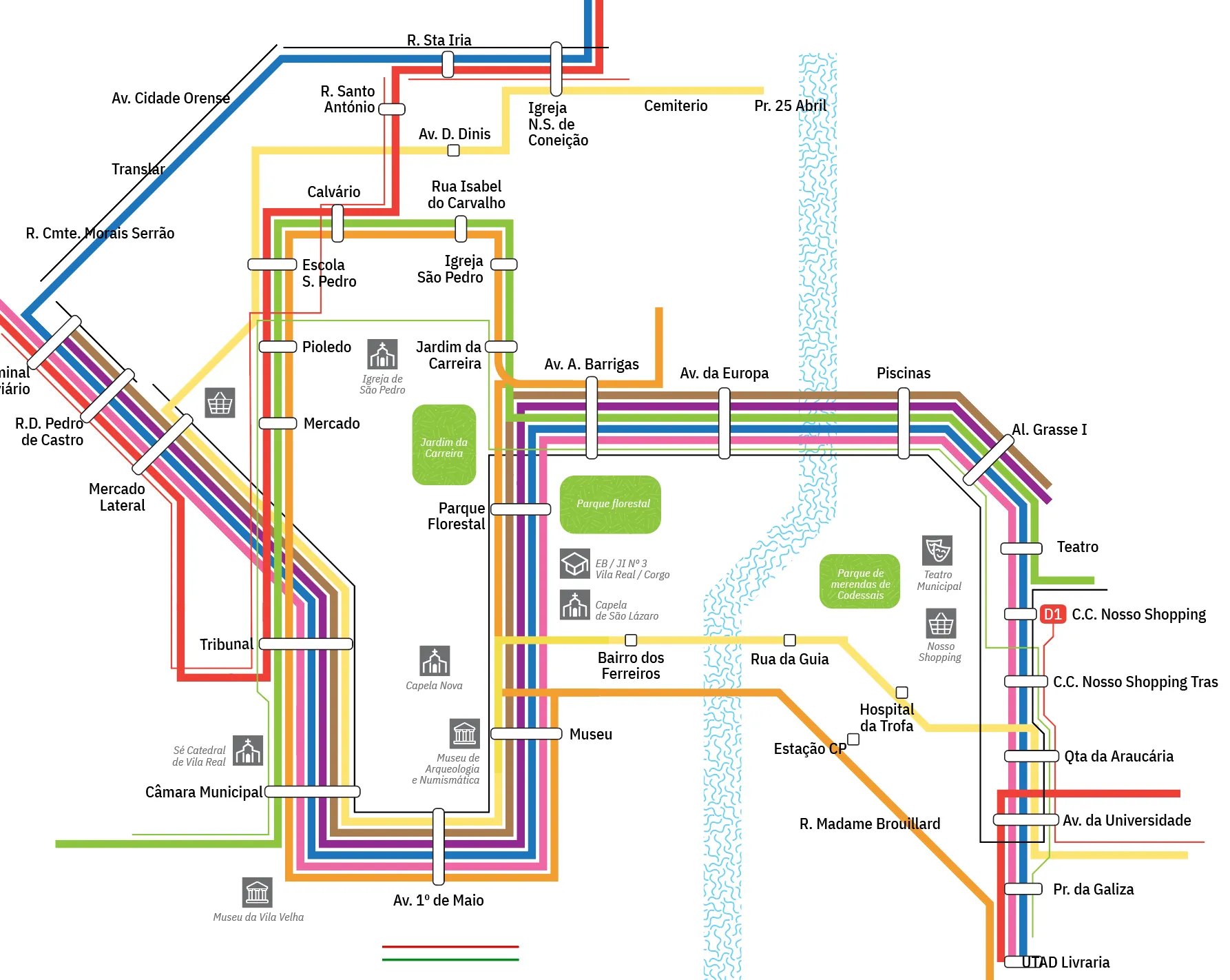
The municipality offers two types of public transportation: urban and suburban. There are a total of 25 bus routes provided by Vila Real Urb. You can find the maps of its routes on its website . I have decided to redesign their current official map of urban buses, which looks like this:

The official map of Vila Real urban buses consists of three separate maps that are not integrated.
As evident, this map comprises three separate sections, each depicting different bus services: routes operating from Monday to Saturday, Sunday buses, and Night buses. Integrating these maps into one cohesive design would enhance user experience. With an integrated map, passengers can gain a clearer understanding of route coverage on Sundays and during night hours. Moreover, consolidating all maps would offer a comprehensive representation of the city's geography and bus routes, facilitating easier navigation for commuters.
Regarding the style of the largest map, I have several considerations and points for improvement:
1. Lack of line continuity: The flow of the lines is disrupted at stops such as Câmara Municipal, Av. da Universidade, or Tribunal. The constant breaking of lines makes it difficult to follow their paths.
2. Inconsistent typography: Font sizes vary inconsistently, and the spacing between text and other elements is inconsistent throughout the map. Typography is sometimes rotated 90 degrees, hindering readability.
3. Inconsistent bus stop styles: The rounded forms of bus stops are not uniformly rounded, and their sizes vary significantly. Some rectangles have one side completely rounded, while others do not. The inconsistency in rounding radius and rectangle sizes detracts from the map's clarity.
4. Poor color combination: The colors used are dull and lack visual appeal. The arrangement of colors in clusters is aesthetically weak.
5. Lack of a regular grid: None of the three maps feature a consistent grid, which would aid in organizing the elements more cohesively. A grid would provide balance, openness, and flexibility to accommodate additional information. In the official map, the absence of a grid results in different angles of lines, unbalanced distribution of bus stops, and irregular rounding of angles, among other issues.
Considering all these factors, let's proceed with redesigning the map.
Note: Please be aware that this map is not an official representation, so it should not be solely relied upon for navigation. I do not bear any responsibility if you get lost.
I thoroughly enjoyed the process of crafting this map. It was fascinating to witness its development from the outset, experimenting with various lines and colors. With a moderate number of lines, the map holds promise for achieving a harmonious balance in composition and color palette.
Here are the first sketches:

At this stage, I took the initiative to propose this redesign to both the Vila Real municipality and the Vila Real Urb. However, after not receiving any response, I proceeded independently with the redesign.

Some of the initial ideas were discarded in this iteration. For instance, the icons were initially too dark and oversized. Additionally, the pattern for the river seemed odd, so I simplified it. However, certain initial concepts persisted throughout the project, such as using white rounded rectangles for bus stops and employing a green pattern for parks and gardens with white titles.

Then, I realized that I had completely overlooked the inclusion of night and Sunday buses. This oversight meant that the initial structure would require significant adjustments. Introducing three additional lines into the skeleton of the map proved to be quite challenging.
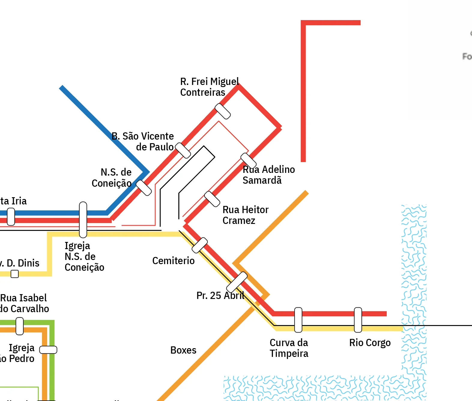
The cluster of bus stops on the opposite side of the Corgo River appears quite compressed due to limited space, exacerbated by the unconventional behavior of thin green and black lines. While I've done my best to ensure readability, I acknowledge that it may pose difficulties for some users.
A tiny adjustment to create more space and improve the balance of line flow. On the Al. Grasse I station, instead of having two angles of 135 degrees, I changed one angle to 90 degrees.


Trying to figure out the arrangement of lines in the N.S. de Conceição zone. While there are several bus stops in the area, some lines don't actually make stops there; they simply bypass the stop altogether.


The map of urban buses consists of three separate maps that are not integrated.
In the picture below, you can see the outline of bus lines and stops. I appreciate consistency and alignment in all aspects.

Although this section shows progress, it's far from being the final version. I've identified some errors, such as the line 12 being too short, but I've decided to address them in the next iteration.


