
1. An overview of Porto public transportation system
2. Analysis of current public transit maps , which includes:
→ STCP geographical map overview


Before delving into the problems with Porto transit maps and the need for an alternative, let's first examine the strengths and weaknesses of the entire public transportation system.
Strong points:
1. In recent years, the metro network has significantly expanded, reaching from Vila Nova de Gaia, crossing Porto, and extending all the way to the north in Póvoa de Varzim.
2. The extensive STCP (Sociedade de Transportes Coletivos do Porto — Society for Collective Transport of Porto) network connects Porto with nearby municipalities, including night buses that link populous neighborhoods with the city center.
3. The Andante system, a recent introduction, involves Porto Metropolitan Area operators in a unified system, enabling cost savings for frequent users across different transportation zones and bus providers.
4. Over 20 service providers contribute to a comprehensive network of routes in the Porto Metropolitan area.

STCP provides pretty good service on about 70 lines
Weak points:
However, each positive aspect is accompanied by a corresponding negative one. Let's explore them:
1. Lack of integration. Train and metro stations often lack access to buses, leading to disjointed transportation options. Bus operators show little interest in serving passengers arriving by metro in certain neighborhoods.
2. Sparse metro lines. Large urban areas lack metro access, compelling people to rely on buses or cars. Poor frequency of metro trains in certain parts of the network, with waits of 20-30 minutes during specific hours, making the transportation mode unreliable.
3. Capacity and demand issues. Growing demand for metro transportation exacerbates issues. Trains sometimes lack sufficient carriages during rush hours, making it challenging for passengers to catch a train. Notably, at the central station, Trindade, on the line connecting Campanhã and Casa da Música, a train can appear only once every 5 minutes during rush hours, a significant inconvenience for a densely populated area frequented by tourists.
4. Andante system complexity. Despite Porto's relatively small size, the Andante system has a complex network of transport zones. Some zones encompass only a few metro stations before another zone begins, contrasting with simpler systems like Berlin's three-zone structure (A, B, and C).
5. Abbreviation overload. Navigating the Andante system is complicated due to numerous abbreviations in zone determinations (e.g., VCD1, VCD2, MAI1, MAI2, MAI3), totaling over a hundred zones.
6. Ticketing challenges. Chaotic zoning makes that purchasing tickets between zones (Z1, Z2, Z3, etc.) requires some mathematical skills due to a multitude of fares. Ticket machines often have lines of people struggling to decipher the system.
Public transportation requires a holistic approach encompassing urban studies, sociology, history, architecture, economics, and design. Extensive research, continually conducted by authorities, is essential for effective planning. Passengers and the community must be involved in the discussion.


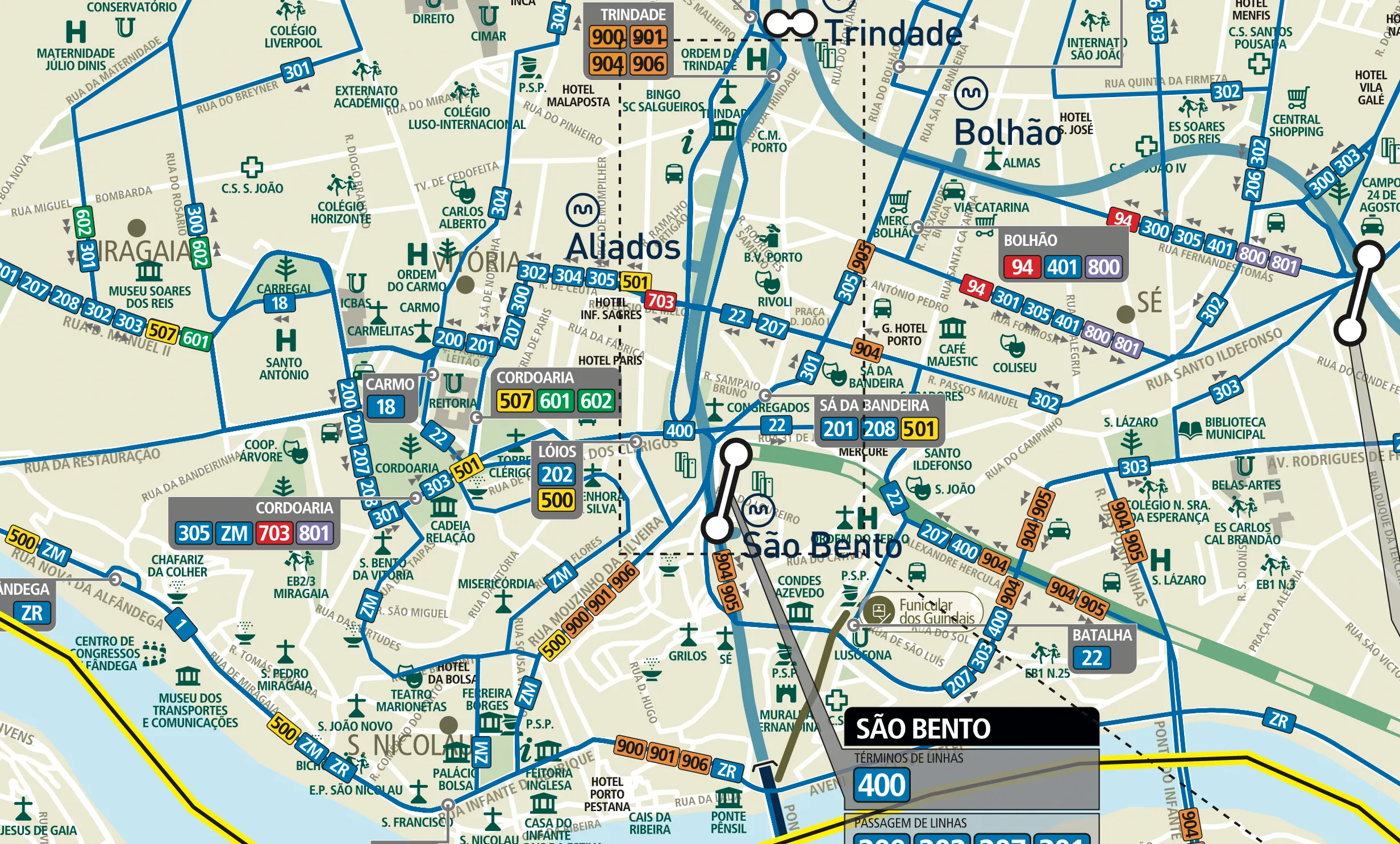
Various maps and diagrams depicting Porto's public transportation system are displayed throughout the city on bus, metro, and train stops. Generally well-designed, these maps do have notable weaknesses, and there are areas that could be enhanced, which we will explore in this section.
Starting with a significant drawback: the lack of integration. The metro map fails to provide information about connecting buses, and conversely, bus maps omit details about intersecting metro and train lines. This lack of cohesion suggests that these separate systems may unintentionally discourage users from exploring alternative routes. For a different perspective, you can explore this alternative map (link), illustrating potential shortcuts that can optimize journey times.


Let's take a closer look at the official Porto metro map, a design that has become an icon in the city. You can explore the original map below or download it from here .

Strong points:
1. Elegant design with smooth lines, well-selected fonts, and ample space for enhanced legibility.
2. Absence of a strict grid allows for improvisation and smooth line flow.
3. Confident scale aids in estimating distances between stations and municipalities.
4. Additional information such as parking, bicycle parking, and bus connections is presented.
5. Typeface, font size and text alignment are well-executed, with terminal stations highlighted with larger font sizes.
6. Well-designed icons and clear depiction of the river and shoreline.
7. Zone areas and borough names are accurately designated.
8. Thoughtfully selected colors for line representation (except for the yellow line).

In many stretches, trains travel overground, so one can enjoy beautiful Porto landmarks
Weak points:
The primary concern with the official map revolves around its depiction of a 5-lines-thick snake crossing Porto city. This has bothered me since I first saw it. Let's be honest: Porto doesn't have six lines; it has only two. Let me explain why.
The first line, depicted in yellow, is a short route connecting Gaia with Hospital São João. The second line, on contrary, is quite complex. It initiates in the east (Fânzeres), passes through the city center, and bifurcates after Senhora da Hora in four different directions. Rather than representing this as a single line, the metro administration and designers divided it into five lines: A, B, C, E, and F.
Compare to London: the Northern (black), District (green), and Metropolitanc (purple) lines of the London Tube have numerous bifurcations. If each destination was illustrated by a different line, London's metro would boast 30 lines instead of 11. The intricacies of a complex London underground system are depicted comprehensively, minimizing the number of lines. Conversely, in Porto, where the metro system is comparatively smaller, an attempt to augment complexity led to the splitting a single line into five, resulting in a bundle of lines that essentially duplicate one another.

The green District line has quite a lot of bifurcations, but all of them are converge into one line in order to mantain clarity of an already overloaded system.
Trains operating on lines A, B, C, E, and F operate on the same tracks and arrive at identical platforms. The train's destination is consistently displayed on the train's head and on information tableaus at metro stations.
While other metro systems, including those in London, Paris, and New York, might join 2 or 3 lines in a bundle, having a thick bundle of five lines is an unprecedented experience in map design.
Assuming that the five lines theory is acceptable, are there any other design concerns that need improvement? The answer is yes, and here's a list:
1. The map has too much empty space, and it seems like the metro lines go to nowhere. Adding bus connections and highlighting key places (stadiums, sightseeings, hospitals, etc.) would improve it.
2. The bus icons at metro stations are useless since they don't indicate the destinations of respective buses. Moreover, several metro stations lack bus signs, although they do have an associated bus stop.
3. Including a train line as a reference point would offer significant benefits. A train line is as essential as, for example, a river, for helping people orient themselves in the city. The train station icons by themselves, without a line, don’t make sense.
4. The Bx trains (express to Póvoa de Varzim) lack a specific designation, which is strange given the available space.
5. Including information about national roads and highways seems irrelevant without connections to above-ground transportation, especially when the train lines are absent.
6. The number of lines passing at Campanhã and Estádio de Dragão stations doesn't match the circles designed.

Campanhã is represented by a 5-stations transfer, while just 4 lines pass here.
7. This map features two types of station designations: white circles merged together to illustrate transfer stations and small "stumps" indicating other stations where no transfers occur. However, following this logic, stations like Lapa, Bolhão, Ramalde, etc., seemingly lack transfer options between lines. In other words, it suggests that one can't change from the A line to the B line at these stations. Interestingly, the London metro system exhibits a similar characteristic, but let’s leave it for another inquiry.
8. The map’s dark background is forgivable with minimal information, but it may be problematic if more details are displayed. Consider adjusting for better clarity.
10. The yellow D line has low contrast on the gray background, making it nearly invisible in low-light conditions. The green color for bicycle parking icons also lack contrast. These two colors completely fail on a contrast checker.
12. It would be better if the colors of terminal stations (black), intermediary stations (very dark grey), and bus/train icons (dark black) either were all black or, otherwise, distinctly different. This enhances visual consistency.
13. Callouts next to the stations, as well as separators between icons, are definitely useless, especially taking into account so much empty space around and no overlapping information.

On the left, original map with callouts and separators. On the right, I tried to remove these elements.
14. The map's title, instead of saying just Metro do Porto, lists a number of lines in alphabetical order: ABCDEF. Is it really necessary?
15. And finally, some minor defects, so inconspicuous that I believe few people have noticed them. The gap between the title Estádio de Dragão and its respective B circle is noticeably smaller than in other similar situations across the map. Another small detail: the right padding on the Batalha and Ribeira boxes is significantly larger than other paddings. I believe maps intended for mass printing on high-quality, durable materials, in a large format (about 1.5 meters high), should avoid such lapses and undergo critical review countless times!

Tiny details regarding alignment
On the illustration below, you can see my humble attemt to improve the central fragment of the metro map:
● the background is brightened ensuring the yellow line stands out more;
● the gap between the lines is closed;
● callouts and separators are eliminated;
● the Ribeira and Batalha rectangles are aligned;
● the purple E circle is aligned with the white transfer circles;
● the Heroismo, Bomfim, and Sé titles are aligned differently;
● stops without transfer changed their color from dark grey to 100% black;
● bus and trains icons are recombined.
I would also straighten the bend on Faria Guimarães station, but performing this task in Photoshop could kill anybody.

The proposal (on the left) would appear more accurate if I had access to the original .ai file. Nevertheless, I tried my best using Photoshop
Okay, I believe that's enough attention for just one map. Let's move forward and explore other maps of Porto public transport system.


STCP (Sociedade de Transportes Coletivos do Porto) is a transportation company offering over 70 routes in Porto City and surrounding municipalities within the Porto Metropolitan Area. More than half of its buses operate on gas, while some are powered by electricity, contributing to reduced environmental impact.Throughout its history, STCP has employed various maps to depict its extensive transport system. In this discussion, we will focus on two of them.
Unfortunately, the source of this map is not specified, but for those interested in downloading the full-size PDF file, here is the link .
Precise, but complex map of the STCP bus routes.
Strong points:
1. Precision in geographical representation is achieved through a meticulously detailed and to-scale map, free from distortions, thereby guaranteeing reliability.
2. Integration of the metro into the map, emphasizing connections between bus and metro routes.
3. Inclusion of train lines enhances city orientation.
4. Correct depiction of bus lines with color-coded distinctions for different neighborhoods in Porto. Arrows indicate bus directions when they pass along one-way streets. All the terminal stops are clearly marked.
5. Detailed inclusion of street names, landmarks, educational institutions, hospitals, stadiums, rivers, green zones, etc.
6. Transportation zones are clearly defined.
7. Thoughtfully chosen colors, typography, line thickness, and well-designed icons contribute to the overall aesthetic appeal.
Weak points:
1. Information overload in the city center, which results in numerous callouts. A particularly large callout is required for Aliados station and circulation on it.
2. Difficulty in tracing routes within the city center due to a complex network of lines.
3. On the opposite side, there is a visible lack of transportation in peripheral areas, creating vast empty spaces on the map.

When printed, this piece of map should occupy at least 1 m2, but it has no valuable information about public transportation.
4. In contrast to terminal stops, intermediary stops are not indicated at all.
5. Printing this map requires a substantial amount of space to ensure legibility in the city center. Regrettably, the peripheral areas will appear as a huge desert devoid of bus routes.
In conclusion, while the STCP Geographical Transit Map boasts artistic qualities and provides comprehensive information, addressing the noted weaknesses, could significantly enhance its usability.
STCP has employed a different design approach with their geometric transit diagram. In contrast to a geographically precise map, here designers opted for a diagrammatic representation. This allows for various conventions, enables the simplification of details, creates more space where needed and compresses areas that are too vast.
This map is actually a series of diagrams, each specific to an individual municipality. In total, there are six maps seamlessly integrated within one design system. You can download them from the official STCP site (you have to click on Concelhos and then choose a specific municipality).
1. Clear universal 45-degree grid, which insures alignment of all the elements: lines, terminal numbers, street names, passing buses numbers. Consistent rounding radius and space between lines in bunches are precisely maintained.
2. Effective use of contrasting colors with a universal white background, enhancing overall readability.
3. Color-coded distinction between lines serving different neighborhoods (green for Maia, yellow for Matosinhos, etc.).
4. Distinctive design for terminal stations, with all bus stops clearly marked.
5. Abundant presentation of street names, compensating for the lack of bus stops names.
6. Detailed and representative big icons for some landmarks and sightseeing spots.
1. Lack of integration with train and metro lines, giving the impression that STCP operates in isolation from other modes of transport.
2. Extremely thick clusters of lines in the city center, leading to complexity and confusion about bus routes.

Locals from became used to this complex diagram, but for newcomers it must be puzzling.
3. Information overload in the center together with vast gaps on the periphery reminds of issues in the previous map.
4. Overemphasis on displaying passing bus numbers at all stops, no exception, which results in, again, information overload in the city center.
5. From the previous point, the next one follows: on the periphery, where one bus line can run alone through 10—15 stops, all of them have the number of this bus, but lack their names.
6. On the periphery (in Maia, Gaia, Valongo, Gondomar), this diagram is geographically not reliable. Look, for example, how the lines in Maia are compressed and bus stops are compressed against each other.

This is to illustrate two things. 1. Abundance of passing bus numbers, and lack of stations' names. 2. Squeezing one corner, when there is so air around.
In summary, this map-diagram by STCP is aestethically modern and precise in many aspects, but still complex. Certain decisions contribute to map overload in some areas and make it less useful in others.
In the Porto Metropolitan Area, there are over 20 public transportation providers. In this section, we briefly discuss the types of transit maps they use to convey comprehensive information about their routes.
Espirito Santo provides over 20 routes within the municipality of Gaia. The company's official site was updated, and the map diagram is no longer available. But you can still have a closer look at it using this link .
Graphically, this transit diagram may be the most imperfect one, but still it is quite informative. Let's start by examining its strengths:

This maps has a lot to improve.
1. Information about bus lines is reliable and accurate, often accompanied by callouts to provide additional specific information
2. Each route is distinguished by its own color, making it relatively easy to differentiate each route in a cluster of other lines.
3. All the stops are unambiguously designated. There are special graphic distinctions for terminal stops.
Unfortunately, the map reflects a general lack of professionalism in map-making. Clearly, this map was not created by a designer. Let's explore the weaknesses of this project:
1. Absence of any sort grid, resulting in a lack of alignment between lines, stops, text information, and other visual elements. Angles between lines and rounding radii appear random, and gaps between lines and text/graphic elements are inconsistent. Arrows are sometimes misaligned within the lines.
2. Lack of uniform typography. The same category of information is represented in up to five distinct styles. Text is inconsistently aligned with its surroundings.
3. Lack of consistency in graphic elements. Bus stops are displayed with different typography and figures of varying appearances. Circles and rectangles intended to contain information about passing buses sometimes feature the bus stop name or the logos of trains and the metro. No consistent style is applied in icon creation, resulting in variations in size and color.
4. Zone indications overlay necessary information in a vulgar style, with thick lines and oversized letters making it impossible to read important information about routes and stops.
Inspired by the this map, I took a different approach to map-making. In summarizing the positive and negative aspects of the original map, I created my own map, which you can can explore here .
The map of public transportation in Maia municipality is a good attempt to create a clear, modern-looking map. The strengths include the following:
1. Consistent and clear grid.
2. Sufficient empty space, allowing the map to breathe.
3. Readable information with clear route identification.

This map presents graphic clarity and consistency, but the lack of intermediary stops makes it quite impractical
However, there are some weaknesses that I believe can be easily improved:
1. Lack of intermediary stops. This information could be seamlessly integrated, considering the amount of free space available.
2. A relatively dark background, hindering the identification of certain lines, such as yellow, orange, and grey-purple.
3. Inconsistency in the presentation of stops—some with circles, some with short strokes, and others with icons displaying points of interest (metro, schools, shopping).
4. Not all terminal stations are shown.
5. Unclear meaning of dark areas on the map (top left corner and on the right).
6. Integration of a metro line would be beneficial, especially as some bus stops connect with the metro.
7. Inadequate line color selection, especially in the section between Maia and Maia Forum.
8. Lack of alignment between text and graphic elements.

Some minor improvements could greatly enhance the visual appearance of this map.
This was a very preliminary attempt to address the issue of comprehensive public transit information in Porto. Many more other maps need to be analyzed and improved, and there is a bunch of other additional materials to be researched. But the general conclusion is that Porto requires a unified, comprehensive map of public transit, integrating all modes of transportation.
If you found this discussion intriguing, you may also want to explore the design process for my Porto integrated map .
You can explore the design system for this project.
Have a look also at the final result of this project.
Thank you for reading! Please do not hesitate to send me your critiques and suggestions.


